Dashboard Overview
Dashboards Overview
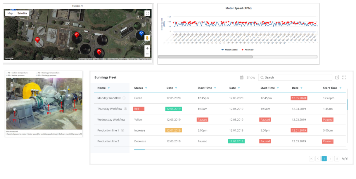
Data visualizations can simplify complex facts and figures, transforming raw data into actionable business insights. Rayven dashboards provide a flexible and powerful way to display information relevant to your specific business needs. They are highly customizable via an easy drag-and-drop interface.
To access a dashboard, navigate to https://live.rayven.io/ and log in using your credentials. For more information on how to create login credentials, refer to Section 3.5 Dashboard Users.
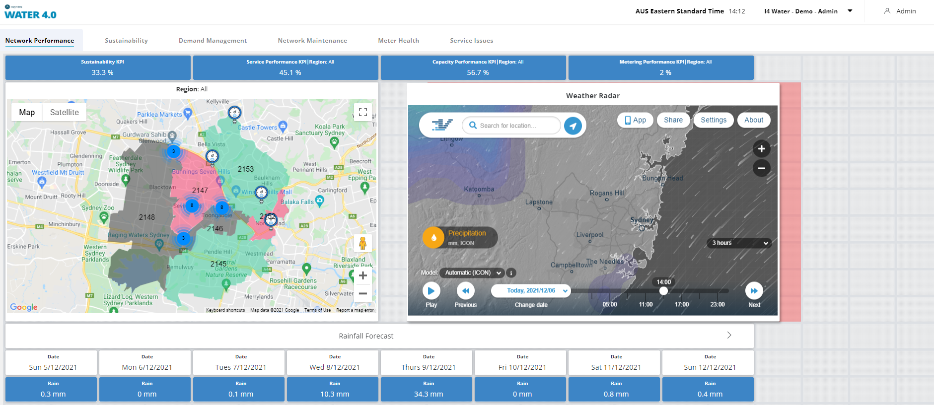
A single dashboard can display information from many devices and you can present this data via a wide range of widgets. You can also combine many different dashboards into a single solution by creating Dashboard User Groups and Dashboard Users.
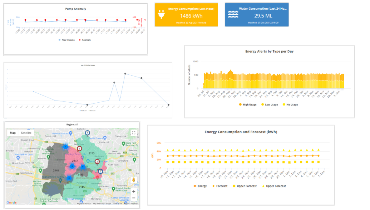
Types of Dashboard Widgets
Alphanumeric widgets
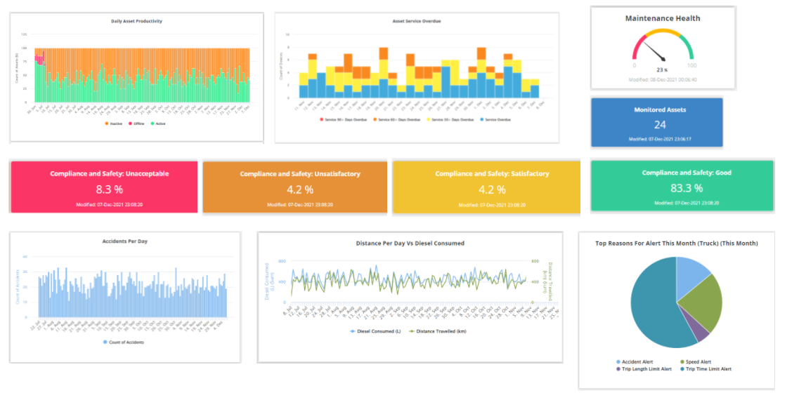
Alphanumeric widgets output your data as-is. They display data via alphanumeric values or visualization tools like monitors, gauges, or percentage bars. The list of Rayven Alphanumeric widgets is as follows:
- Value - displays an alphanumeric value,
- Multi-Value - displays multiple alphanumeric values in one widget,
- Alert - displays conditional alphanumeric messages and has a colored background,
- Monitor - displays alphanumeric values with range-dependent color coding,
- Gauge - displays a gauge with range-dependent color coding,
- Percentage - displays a bar or column with range-dependent color coding,
- Level - display a tank icon with range-dependant color coding,
- Tabular Data - displays the most recent instances of multiple fields,
- Raw Data - displays the full history for multiple fields.
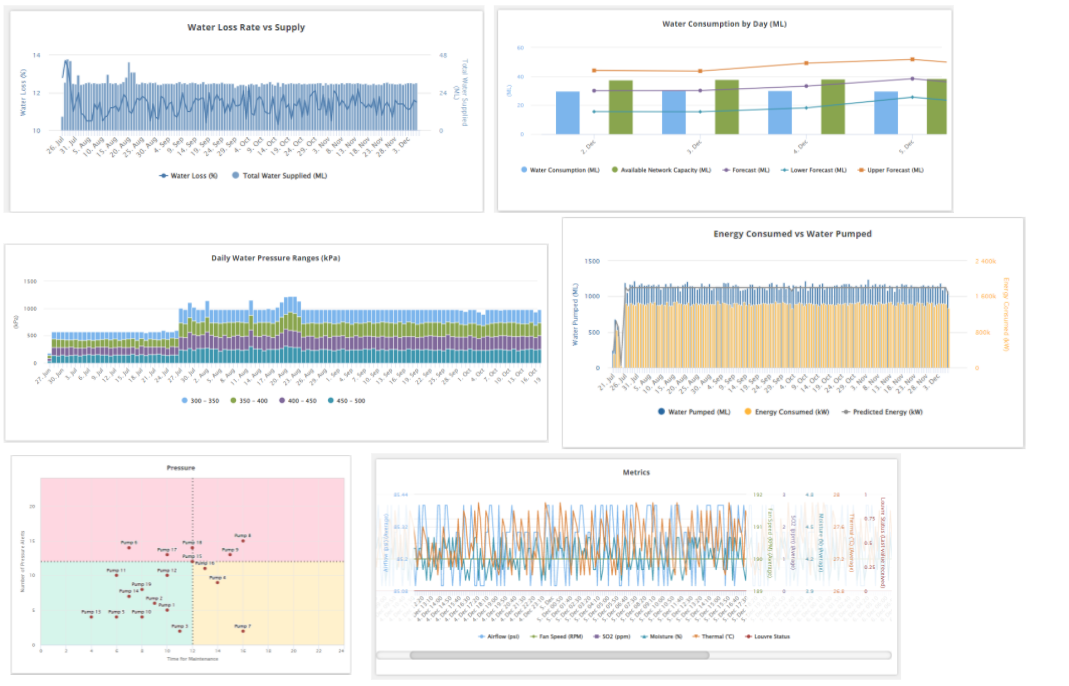
Chart widgets
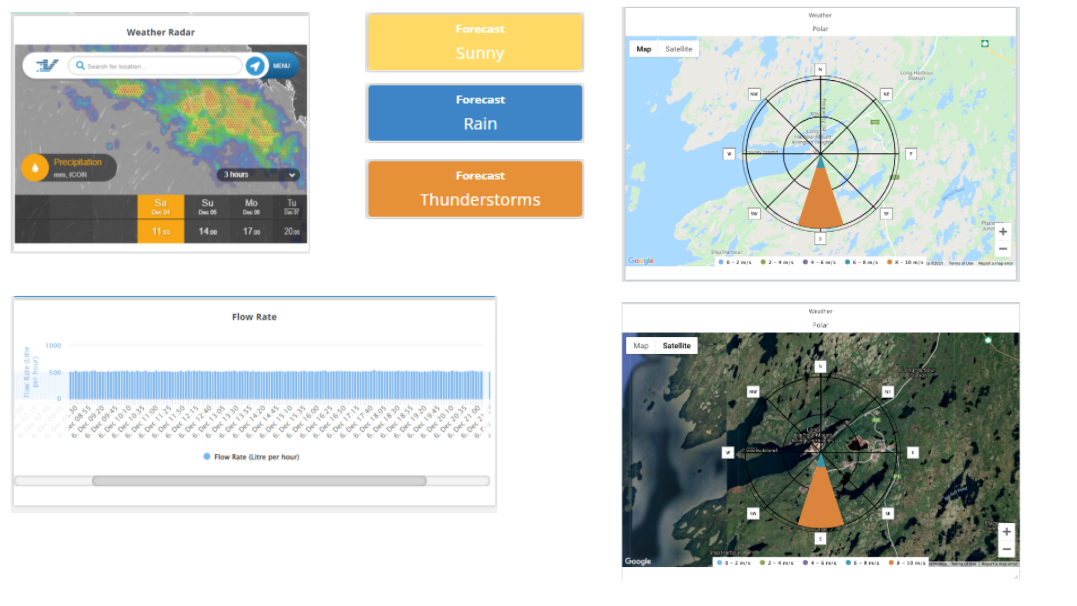
Chart widgets transform your data into graphical representations. The Rayven Chart widgets are as follows:
- Pie Chart - shows proportions by device or by field as part of a circular whole,
- Line Chart - displays a time series line chart with or without comparison and target lines,
- Bar Chart - displays a time series bar chart with or without comparison and target lines,
- Pareto Chart - creates a chart with both bar and line graphs that is configurable for frequency or sum of events,
- Cartesian Chart - creates a dot plot with configurable quadrants,
- Multi-Axes Chart - shows multiple variables as lines and or columns,
- Forecasting Chart - creates a line chart with forecasting models and projected results,
- Control Chart - displays an I-MR control chart with Nelson Rules,
- Polar Chart -displays the distribution of vectors over time,
- Category Bar Chart - configures and displays data using fixed categories on the x-axis.
Object widgets
Object widgets use visual icons or materials such as maps, images, or video streams to display your data. The Rayven Object widgets are:
- Map - displays data on a map, with configurable highlighting, geofencing, tracking, proximity, and drill down,
- Images - displays your data over a static image,
- Live Video Stream - displays your data over a live video stream.
